Concept Flow Exploration.
Final "Happy path" Flows
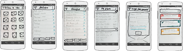
Home Screen

Different Screens


Mockup's of different categories and profile view.
Final "Happy path" Flows
Different Screens
Different Screens


Mockup's of different categories and profile view.
Final "Happy path" Flows
Different Screens
Different Screens


Mockup's of different categories and profile view.
Final "Happy path" Flows
Different Screens


Different Screens

Mockup's of different categories and profile view.
University App - A Mobile App for New Students
Date: Apr. 2013
Role: UX researcher, UX designer, Graphic Designer
Platform : Android
Tools: MIT APP Inventor, Wire frame Sketcher(Trial Version), Paper prototype, Morae.
Design Problem :
The current research landscape and affordances of mobile devices towards facilitating better user experience for intuitive interaction with a case study related to the use of mobile technology for context-based intuitive information presentation for students who are new to the college environment and how mobile technology can assist them to easily adjust to the new environment.
Design Solution :
One such interaction is the use of mobile devices for receiving alerts and notifications to the users in a meaningful manner that is intuitive and increases the richness of the UX to manage schedules and deadlines. For example, audio cues may not be an acceptable interruption during class or a meeting with a supervisor. Mobile devices are often used as a means to receive messages or alerts that may be time sensitive such as next appointment in 15 minutes, reminders to take care of a task, new emails, voicemail, text messages and so on. Depends on the context of the environment and content of the message , the alert will decides the priority level and then the user will receive in different colors. Based on the cognitive load theory I assigned pale green color for the low priority message , red as an emergency alert , yellow as the medium priority message and I also assigned the available timing for the alert to stay on the screen and number of times the beep sound based on the different priority levels.
Design Process :
Before prototyping began, four users from the sample population were informally interviewed for needs assessment. A need that was documented across all interviews was that they would like to be able to access deadline and activity information without having to access their email. For the design, they requested that an app should be very easy to use so as not to make it complex with asking for more user inputs. Most indicated they miss appointments, assignment deadlines, and information regarding the class schedules, and need an alert system that tracks all of these in one spot.
A heuristic evaluation method was used for analyzing the design of the user interface. Twelve experts in the field of human factors engineering were asked to participate on evaluating the scenarios. There were nine scenarios to represent the combination of High Context – High Alert, High Context – Medium Alert, High Context- Low Alert, Medium Context- High Alert, Medium Context – Medium Alert, Medium Context – Low Alert, Low Context – High Alert, Low Context – Medium Alert, Low Context – Low Alert. Participants were asked to interact with the prototype and provide their heuristic evaluation on the user interface and user interaction. They were also asked to think about the intuitive interaction design of alerts and provide their feedback on a scale of 1-10 (1 being very low/poor and 10 being very high/good) on the factors that align with the principles of intuitive interaction. They were also asked to fill out a post-questionnaire on factors related to usability, intuitive interaction design, and user experience. A document is prepared for to presents the findings from the study.
Prototype Details:-
Below is the link for to access the workable prototype. It is developed using MIT APP Inventor
http://ai2.appinventor.mit.edu/
(Please Contact me to access the link)